Understanding the Dataset
Before any analysis, we need to know what we're working with. How big is the data? What type of information does each column hold? Are there any problems with it?
How many rows and columns are present in the data?
Think of the dataset as a spreadsheet with 1,898 rows — one for each order ever placed — and 9 columns of information about that order: who ordered, from which restaurant, what cuisine, how much it cost, how long prep and delivery took, whether the customer left a rating, and what day of the week it was.
What are the data types of the different columns?
Each column stores a different type of data. Numbers that represent IDs (order number, customer ID) are stored as integers. Prices use decimals. Text columns store categories like "American" or "Weekend". Knowing the type matters because you can't, for example, take the average of a text column — you'd first need to convert it.
Data Cleaning
Real data is rarely perfect. We need to fix problems before we can trust the analysis.
Are there any missing values? How do we handle them?
The rating column contained the text "Not given" wherever a customer didn't leave a review. That's not a number — so before we could do any maths with it, we converted every "Not given" into a proper blank value (called NaN, meaning "not a number").
We chose not to fill in those blanks with a made-up number, because a missing rating isn't the same as a bad rating — it just means the customer didn't bother. Keeping them blank preserves that distinction. Every other column was complete — no other gaps to fix.
What is the statistical summary? How long does food preparation take?
A statistical summary gives you the "shape" of each column at a glance — the lowest value, the highest, the average, and how spread out the data is. Prep time is remarkably consistent: it always falls between 20 and 35 minutes, with an average of about 27. That's a narrow window — restaurants seem to have reliable kitchen speeds.
Adding prep (27 min) and delivery (24 min) gives a total expected wait of ~51 minutes from clicking "order" to food at the door.
Data Quality: Outliers & Missing Ratings
Before diving into the main analysis, we do extra checks — catching extreme values and quantifying how many ratings are actually missing.
Are there any unusually extreme values hiding in the data?
The IQR (Interquartile Range) method flags outliers by looking at the middle 50% of all values and marking anything dramatically above or below as suspicious. Picture the full range of delivery times — most cluster between 17 and 31 minutes. An order taking 60 minutes would be flagged as an outlier worth investigating.
In this dataset, outliers in delivery time and cost reflect real operational edge cases (slow restaurants, large orders) rather than data entry errors — so we kept them in rather than deleting them. They're genuine data points the business needs to understand.
How many orders are not rated?
Nearly 4 in 10 orders were delivered without the customer leaving any rating. That's a significant blind spot for the business — if you can't measure satisfaction, you can't manage it. Of the orders that were rated, the average score was 4.34 out of 5, with no ratings below 3 stars at all. So the customers who bother to rate are generally happy — but there's a large silent majority whose experience we simply don't know.
Exploratory Analysis: Distributions (Q6)
Before answering specific questions, we plot each variable individually to understand its shape, range, and quirks. These charts are the foundation of everything that follows.
Order Cost Distribution
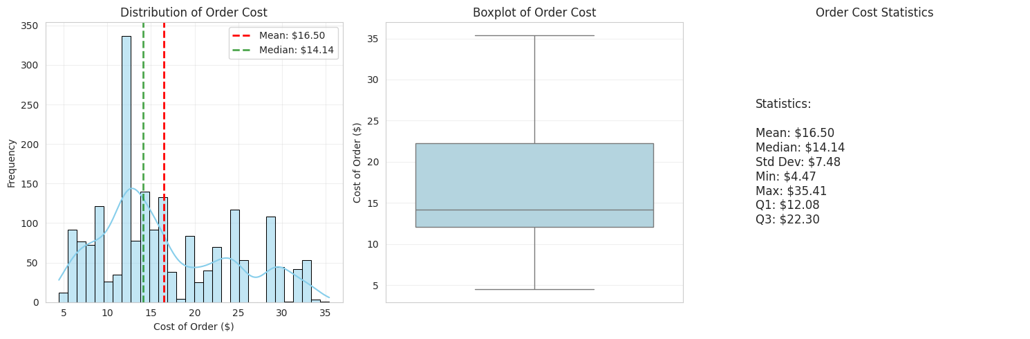
The cost distribution is right-skewed — most orders cluster in the $10–$18 range, but a long tail stretches toward $35. The mean ($16.50) is pulled above the median ($14.14) by those expensive outlier orders.
In plain terms: most people order a mid-priced meal, but a notable minority splurge on expensive orders — and those high-ticket orders matter more for FoodHub's revenue (higher commission rate).
Food Preparation Time Distribution
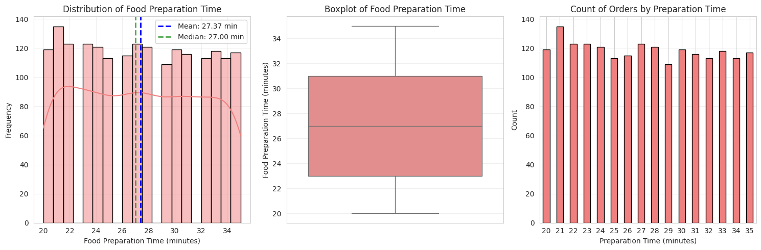
Prep time is remarkably consistent — always between 20 and 35 minutes, nearly symmetric around a mean of 27 minutes. The mean and median are almost identical, which tells us there are no extreme outliers pulling the average up or down.
This suggests restaurants on the platform have reliable, predictable kitchens — good news for setting customer expectations accurately.
Delivery Time Distribution
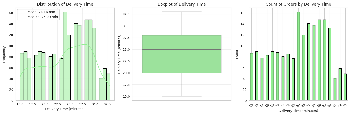
Delivery time ranges from 15 to 33 minutes and is roughly symmetric — no extreme outliers on either end. Most deliveries land in the 20–28 minute window.
Combined with prep time (~27 min), the average customer waits around 51 minutes total. That's competitive for New York City.
Rating Distribution
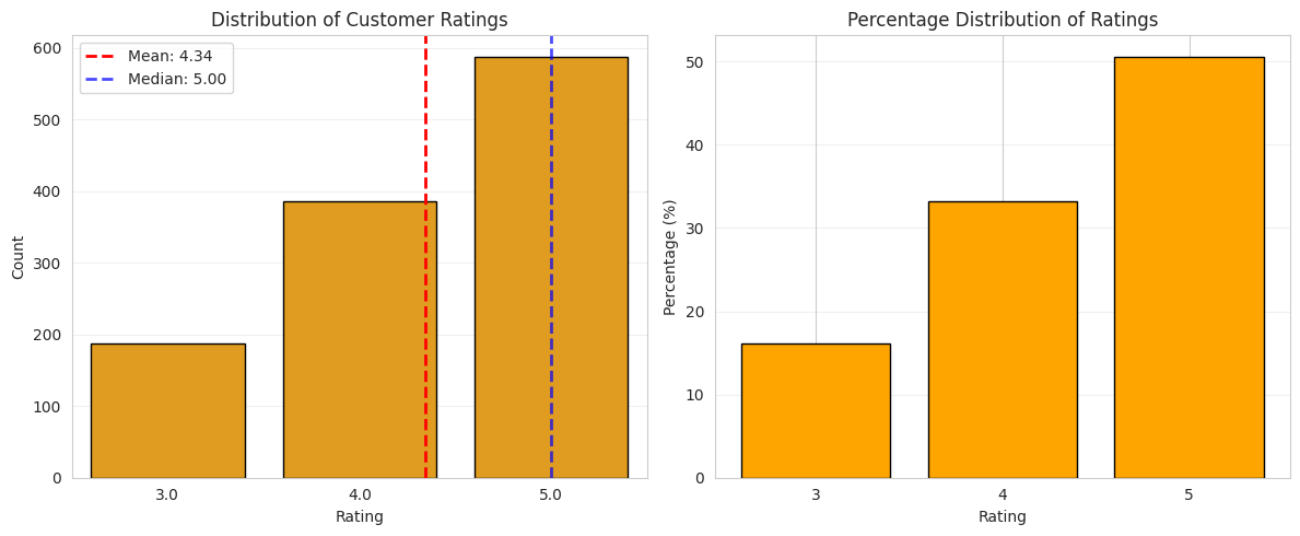
No customer who left a rating gave fewer than 3 stars. The vast majority (84%) gave 4 or 5 stars. The rating of 5 is the single most common score. This sounds great — but remember, 39% of customers left no rating at all, so we're only seeing the feedback of those who bothered to respond.
The silent 39% could be happy, unhappy, or indifferent — we simply don't know.
Day of Week: Weekend vs Weekday
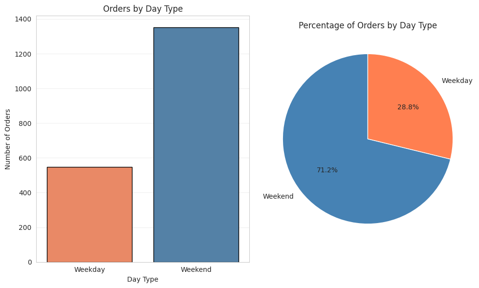
71% of all orders are placed on weekends. People are far more likely to order in on a Saturday or Sunday than during the work week — which makes sense: more leisure time, less cooking motivation.
This has big operational implications: FoodHub needs to staff its delivery network primarily for weekends, and any capacity issues will most acutely show up then.
Cuisine Type Distribution
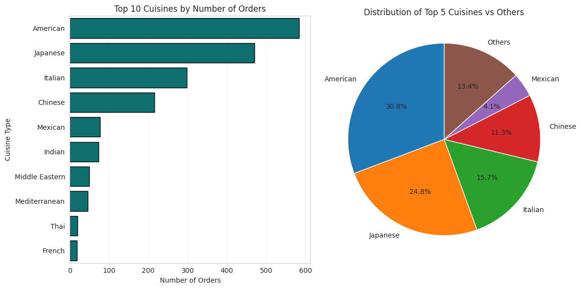
American cuisine dominates, accounting for nearly a third of all orders. Japanese is a strong second. The top three cuisines (American, Japanese, Italian) together make up over 70% of all orders.
This concentration tells FoodHub where to focus restaurant recruitment efforts and promotional spend.
Restaurant Volume Overview
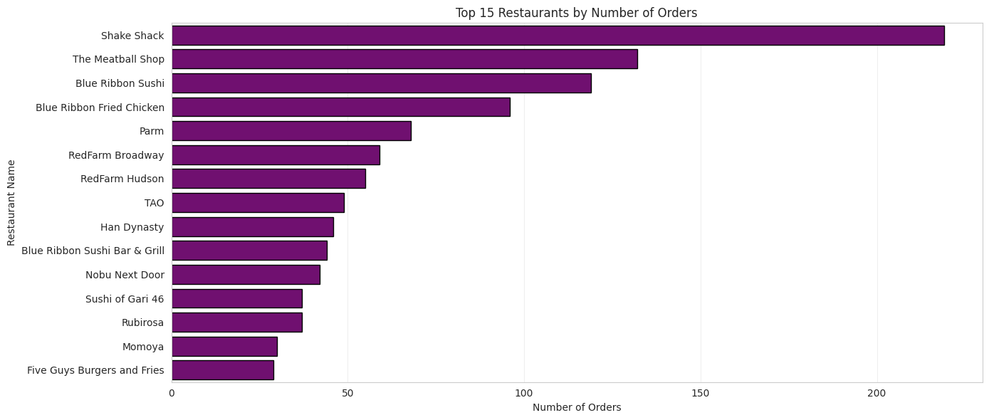
The platform hosts 178 different restaurants, but order volume is highly unequal — a small number of restaurants account for a disproportionate share of orders. This is a classic "long tail" distribution: a few stars, and then hundreds of smaller players.
Top Restaurants by Orders (Q7)
Which are the top 5 restaurants in terms of orders received?
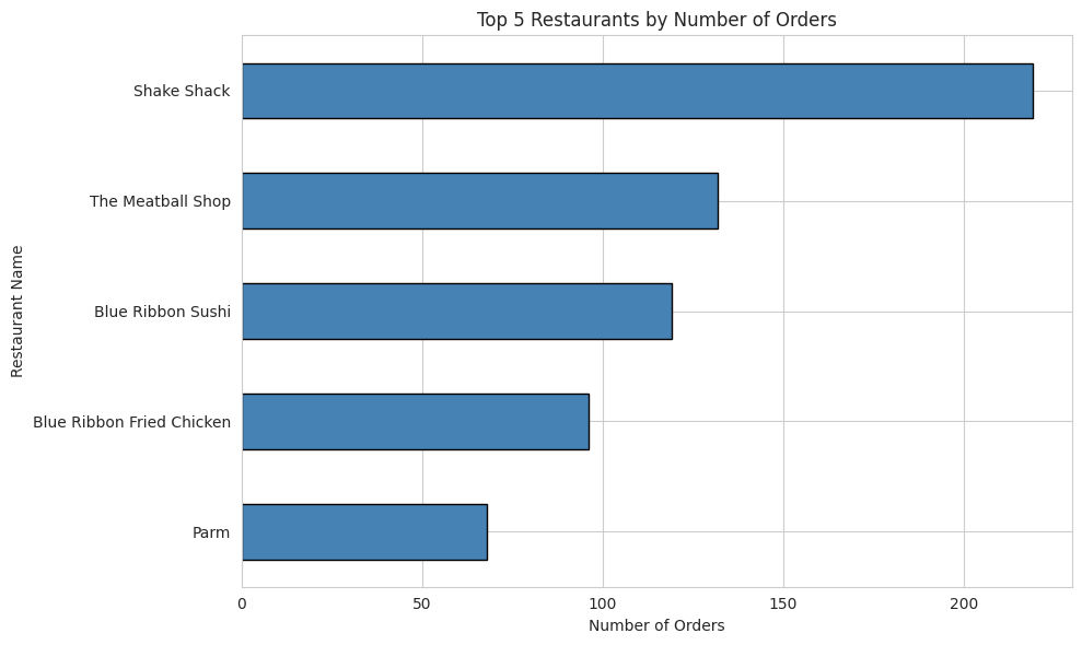
Shake Shack is the clear winner — with 219 orders, it gets almost 70% more than its nearest competitor. That's brand power at work: people know it, trust it, and order from it repeatedly.
These five restaurants represent a critical revenue source for FoodHub. If any of them left the platform or had quality issues, it would meaningfully impact the business. They deserve priority attention and support.
Most Popular Cuisine on Weekends (Q8)
Which cuisine is most popular on weekends?
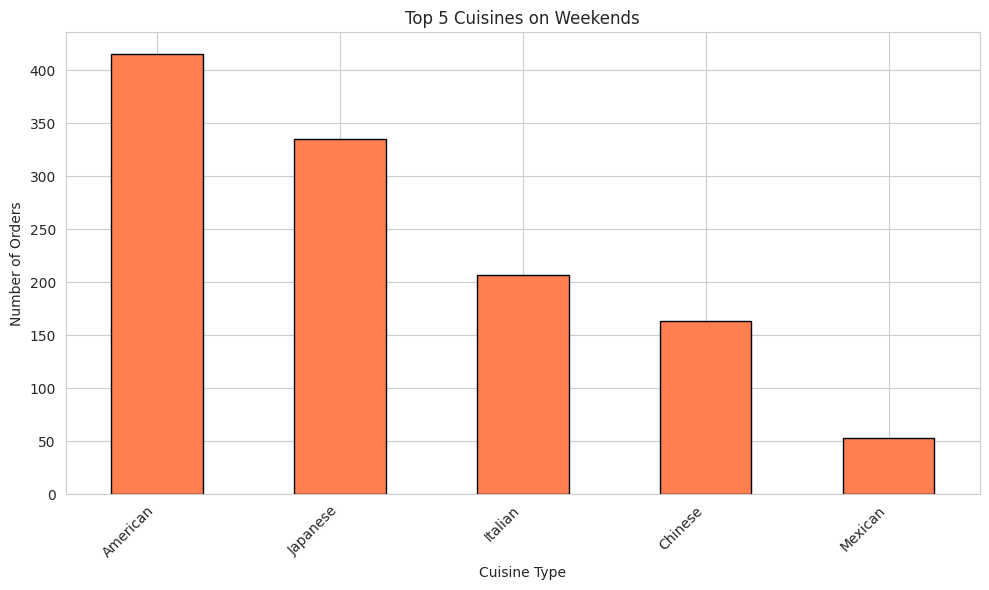
American food wins the weekend — 415 weekend orders, nearly a third of all weekend activity. Japanese is a strong second. The ranking mirrors the overall platform distribution, but weekend volumes are much higher across the board.
For FoodHub's marketing team: weekend promotions tied to American and Japanese restaurants would target the highest-demand segment at exactly the right time.
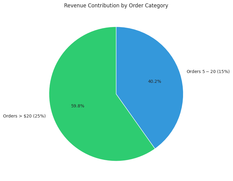
Orders Costing More Than $20 (Q9)
What percentage of orders cost more than $20?
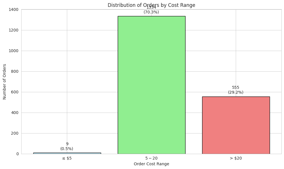
About 1 in 3 orders costs more than $20. This matters financially because FoodHub charges a higher commission (25%) on these orders versus 15% on the $5–$20 tier. So while they're only 29% of orders by count, they generate a disproportionate share of revenue.
Barely any orders (0.47%) fall under $5 — the lowest commission tier. That tier is essentially irrelevant to FoodHub's business.
Mean Delivery Time (Q10)
What is the mean order delivery time?
The average delivery rider takes just over 24 minutes to pick up and drop off an order. Add in the ~27 minutes the kitchen needs, and the typical customer is waiting about 51 minutes in total. For a city as busy as New York, that's a reasonable benchmark — though as we'll see later, a meaningful slice of orders exceeds 60 minutes.
Top 3 Most Frequent Customers (Q11)
Who are the top 3 most frequent customers, and how many orders did they place?
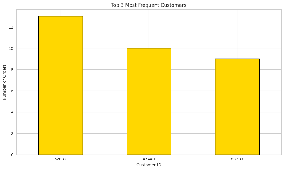
The most prolific customer placed 13 orders — compare that to the average customer, who orders only once or twice. These three "power users" represent a tiny fraction of the customer base (1.69% of orders) but are clear loyalty candidates.
FoodHub decided to reward them with 20% discount vouchers — a smart move to keep their best customers engaged and ordering regularly.
Multivariate Analysis (Q12)
So far we've looked at each variable on its own. Now we compare them against each other — looking for relationships, patterns, and surprises.
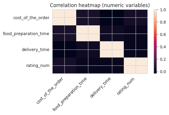
How do all numerical variables relate to each other?
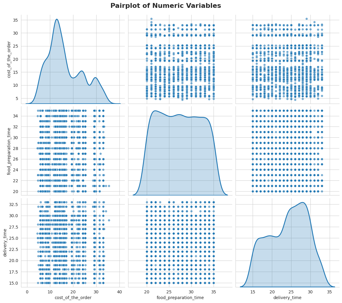
A pairplot is a grid of mini-charts. Each row and column represents a variable (cost, prep time, delivery time, rating). Where two different variables cross, you get a scatter plot showing how they relate. Where a variable meets itself (the diagonal), you get its distribution.
The key takeaway here: almost no strong relationships exist between these variables. The dots form clouds rather than lines, which means knowing someone's delivery time tells you almost nothing about their rating or order cost — they're largely independent.
Do any variables move together?
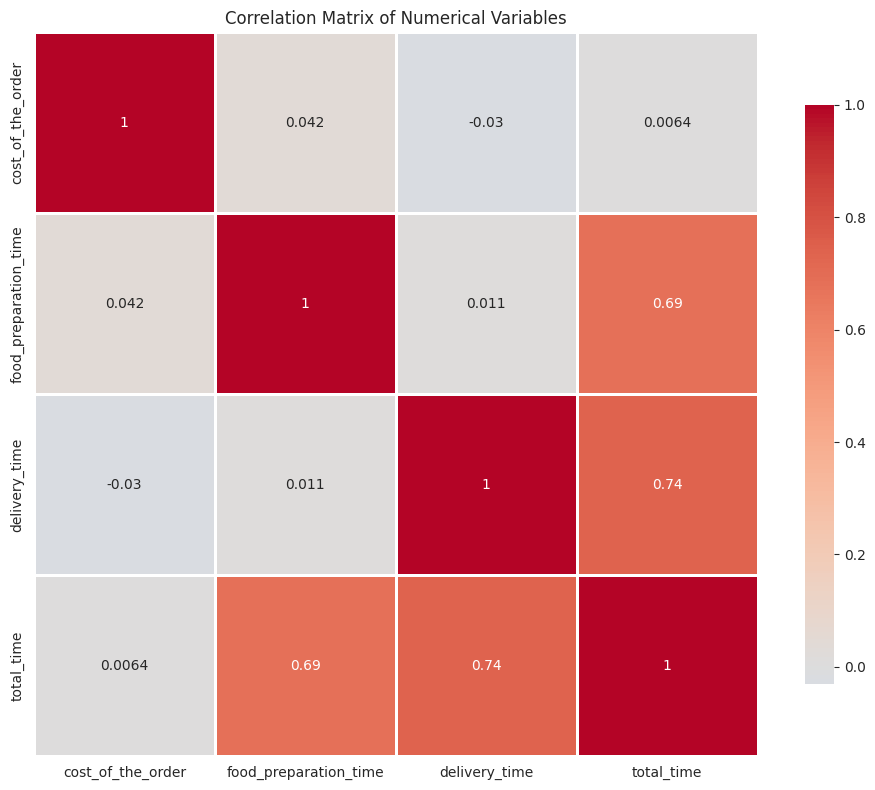
Correlation scores range from -1 (perfect opposite) to +1 (perfect match). Scores near 0 mean no relationship. The only notable relationship here: prep time and total time correlate at 0.69 — which makes sense, since total time is literally prep + delivery. Everything else is essentially uncorrelated.
This is important: a longer prep time does not lead to worse ratings, and a more expensive order does not take longer to deliver. Each variable stands on its own.
Do people spend more on weekends?
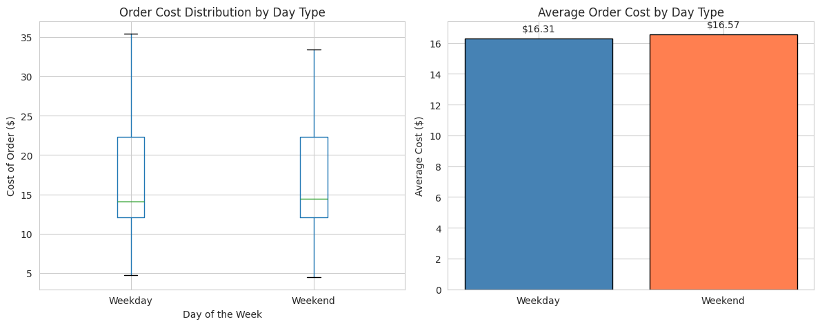
Barely any difference — people spend almost exactly the same on weekdays and weekends. The $0.26 gap is statistically negligible. Day of the week doesn't influence how much someone orders.
Is delivery actually slower on weekends?
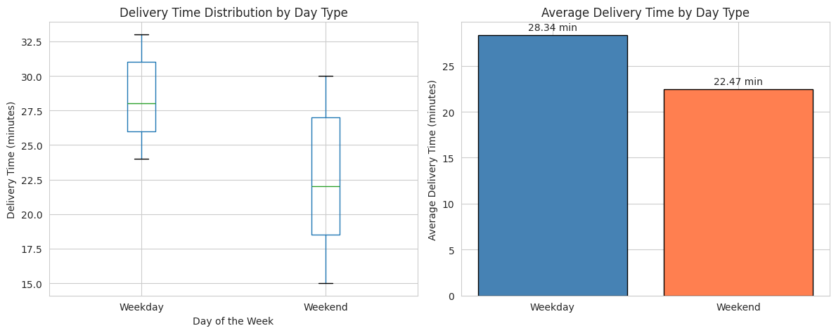
Counterintuitively, weekends are actually faster for delivery (22.5 min vs 28.3 min on weekdays). This was confirmed statistically — the difference is real, not random noise.
A likely explanation: on weekdays, delivery riders face more traffic (office rush hours, lunch surges). On weekends, while order volume is higher, the geographic patterns may be more spread out and traffic lighter. This is the kind of non-obvious insight that data science reveals.
Which cuisines tend to be most expensive?
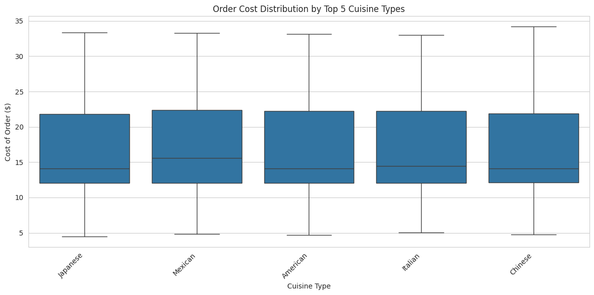
French and Southern cuisines command the highest average order values — nearly $20 per order, triggering FoodHub's higher commission tier. The cuisines most popular by volume (American, Japanese) actually sit in the mid-range for cost.
This suggests a trade-off: French cuisine generates more revenue per order but fewer orders overall. American cuisine generates high volume at a slightly lower margin per order.
What drives customer ratings?
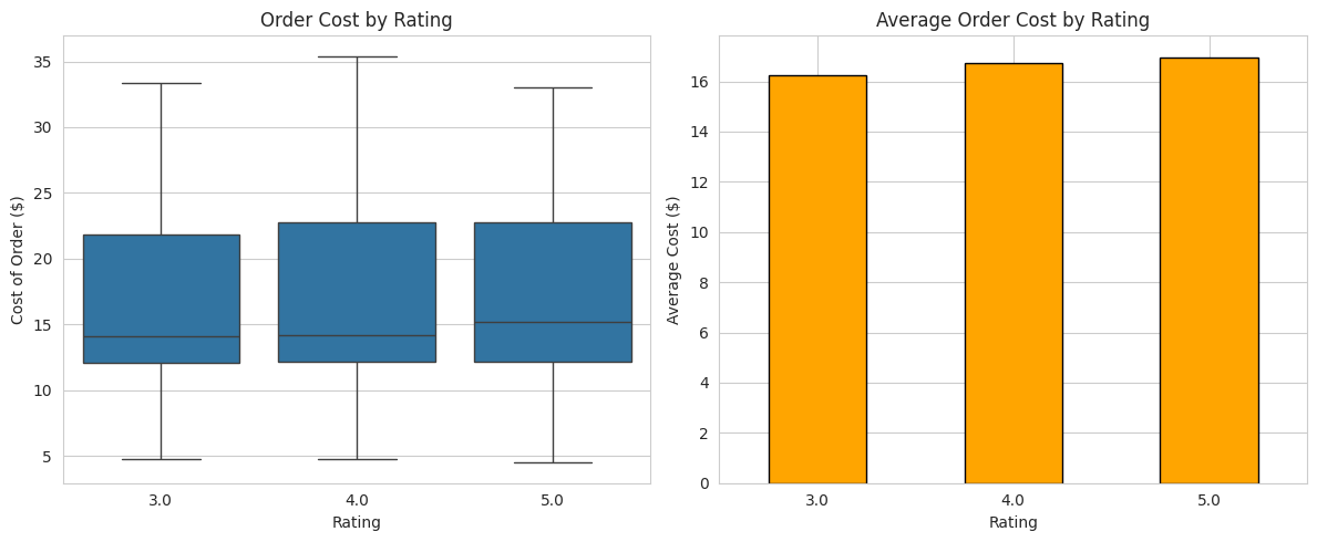
Neither delivery speed nor order cost strongly predicts ratings. Higher-rated orders do cost slightly more, but the difference ($16.22 for 3-star vs $16.97 for 5-star) is tiny. What drives a 5-star vs 3-star rating remains unclear from this data alone — it likely depends on food quality and the human element of service, which aren't captured in these columns.
Restaurants Eligible for Promotions (Q13)
Which restaurants qualify for a promotional offer? (50+ ratings AND average rating > 4)
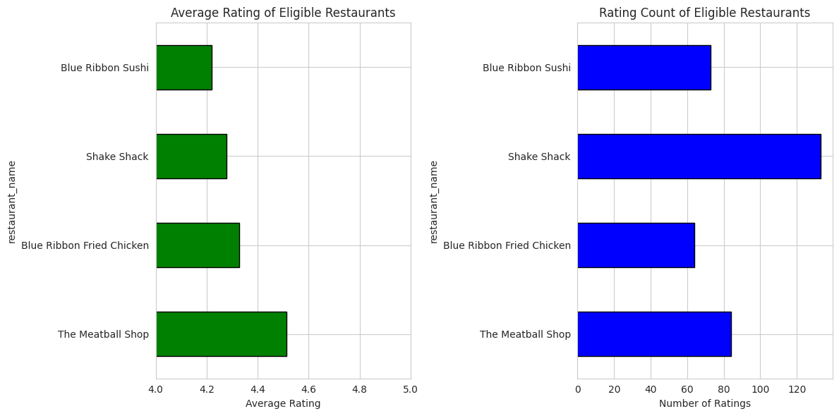
Only 4 restaurants meet both conditions simultaneously — high volume (50+ ratings received) AND high quality (average above 4 stars). The criteria are deliberately strict to ensure promotional backing goes to partners who are both popular and consistently excellent.
Interestingly, Shake Shack — the platform's top restaurant by volume — may not make the cut on average rating. This hints that volume and quality don't always go together.
Net Revenue Generated (Q14)
How much revenue does FoodHub generate across all orders?
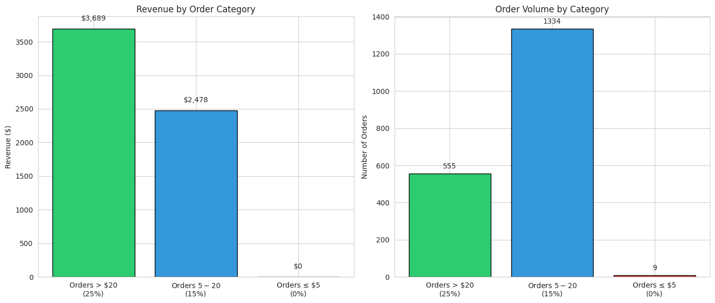
FoodHub earned $6,166.30 in commission across all 1,898 orders — an average effective rate of 19.69%. Even though orders above $20 represent only 29% of all orders, they generate a disproportionate share of revenue due to the higher commission rate.
The tiered structure creates a clear financial incentive to attract and retain higher-value orders. Every dollar increase in average order value above $20 earns FoodHub 25 cents — a compelling reason to promote premium restaurants and larger basket sizes.
Orders Taking More Than 60 Minutes (Q15)
What percentage of orders take more than 60 minutes from order to delivery?
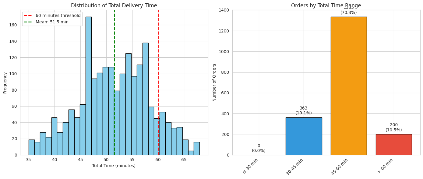
1 in 10 orders takes more than an hour. That's the threshold where customer frustration typically kicks in — and where negative reviews become far more likely. With 200 such orders in the dataset, this is a real operational challenge.
The average total time of 51.5 minutes sits tantalizingly close to that 60-minute line. Any restaurant or route that runs even slightly slower than average risks pushing orders over the edge. Identifying and fixing those bottlenecks is a high-priority recommendation.
Weekday vs Weekend Delivery Time (Q16)
How does mean delivery time compare on weekdays vs weekends?
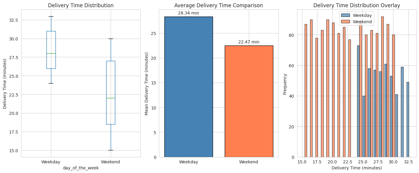
Weekday delivery averages 28.3 minutes — nearly 6 minutes longer than the weekend average of 22.5 minutes. A Welch t-test confirms this difference is statistically significant: it's not a fluke of the sample.
Weekend delivery also has more variability (std 4.63 vs 2.89) — so while the average is faster on weekends, the experience is less predictable. Some weekend orders are very fast; others take longer.
Operationally: weekday delivery is slower and more consistent; weekend delivery is faster but more variable.
Conclusions & Recommendations (Q17)
Every finding translates into a concrete action the business can take.
Key conclusions from the full analysis
1. Ratings coverage is limited. 39% of orders go unrated, which means nearly half the customer experience is invisible. The ratings we do have skew positive (mean 4.34), but silence isn't the same as satisfaction.
2. A long-tail delivery risk exists. While average wait times are reasonable, 10.5% of orders breach 60 minutes — a known trigger for dissatisfaction. The underlying causes (slow restaurants, difficult routes) need to be identified.
3. Platform concentration is high. A handful of restaurants (Shake Shack, The Meatball Shop, Blue Ribbon Sushi) drive a large share of orders. This is both a strength (reliable revenue) and a risk (dependency).
4. Weekends are the core business. 71% of orders land on weekends. The platform's operational model must be designed around weekend demand, not weekday demand.
5. High-value orders are the profit engine. Orders above $20 (29% of volume) drive disproportionate revenue through the higher commission tier. Growing this segment — through restaurant mix or basket-size incentives — is the clearest financial lever.
Action-oriented recommendations for the business
A) Fix the ratings gap. Add a frictionless in-app rating prompt delivered minutes after the order arrives. A 1-click rating (then optional comment) removes barriers. Even a 10-point increase in rating participation would significantly improve operational visibility.
B) Attack the 60-minute problem. Identify which restaurants, time slots, and delivery routes are responsible for orders breaking the 60-minute threshold. Work directly with those restaurants on kitchen speed, or adjust delivery zone boundaries.
C) Protect your top restaurant relationships. Shake Shack, The Meatball Shop, and Blue Ribbon Sushi are too important to lose. Offer them preferential support, faster dispute resolution, and joint marketing to keep them deeply engaged with the platform.
D) Build a proper loyalty programme. The top 3 customers place 9–13 orders each. A structured loyalty scheme — points, tiers, exclusive perks — would expand this "power user" segment beyond three individuals.
E) Plan capacity for weekends. Staffing, delivery assignments, and support resources should be biased heavily toward Saturday and Sunday. Weekday operations are a secondary priority.
F) Grow high-value orders. Promote family meals, bundle deals, and premium restaurants that naturally produce orders above $20. Each additional dollar above the $20 threshold earns FoodHub 25 cents — the clearest unit-economics lever available.